If you’re driving a decent amount of traffic to your online store, but not converting as many visits into sales, you’re not alone.
According to Statista, only 2.42% of an eCommerce site’s traffic results in purchases. And one of the biggest reasons why the conversion rates are so low, are the product pages.
You have the best of product images — even a video.
You have added an in-depth product description.
You have a clear ‘buy now’ button too.
You’re following possibly every conversion optimization tip out there. How is it even possible to optimize your product pages any further?
Well, we got some new tips that have proven to improve the conversion rate of global brands.
Product page optimization tips
1. Remove shopper distractions on the consumer browser
Wait. What?
No, we’re not talking about the banner promotions or pop-ups that you’ve added to promote deals. We’re talking about all those competitors who have been advertising on your site – without you knowing about it.
Online shoppers tend to have a minimum of ten browser extensions and web apps installed. While they may seem handy for comparing prices and scheduling tasks, they are not that good for your store.
Some of these extensions and apps inject adware onto your site on the consumer browser. The adware results in unauthorized content showing up on your product pages. And the most common distractions that we have seen after analyzing 100+ enterprise stores, are:
- Competitor Ads
- Adult content
- Video Ads
- Spam pop-ups
- Price comparisons
Now you might think an ad or two couldn’t take away the shopper’s attention from your product images. But here’s what browser injected ads look like in real:
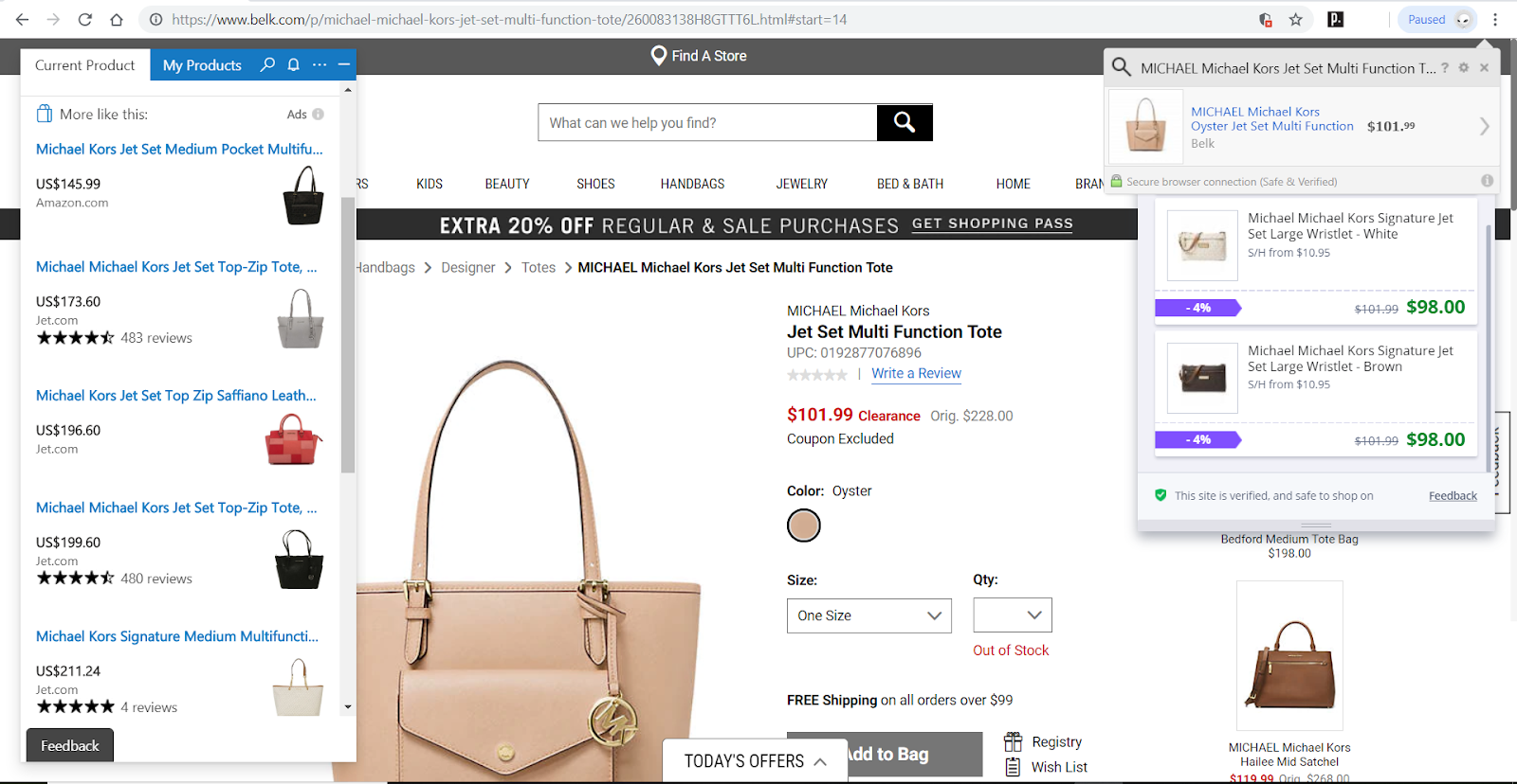
They are not just promoting competitor ads and unauthorized content on your store, but also really blocking out your content.
How is a shopper even supposed to maneuver through these ads to reach that product description you spent fifteen minutes writing?
Now there’s a massive 16% of your site traffic that is seeing these ads.
Even global brands like Nine West, Kirkland’s and others noticed the amount of revenue they were losing to these unauthorized promotions.
But removing these distractions requires you to do two things.
First, Continually monitor and analyze adware strains that could come from browser extensions and apps on the consumer side. Second, predict the distractions it will inject onto the site and remove them proactively.
Considering that there are more than 13,000 adware strains introduced into the digital space every day, it is tedious. That’s where you can use BrandLock’s Shield.
Shield doesn’t just monitor and analyze adware strains but works with a team of R&D experts to identify the ads they can inject. It then proactively removes these ads before they even show up on the consumer’s browser.
When you remove distractions, shoppers can focus more on your product. The more engaged they remain with what you’re offering, the higher are the number of conversions.
To read how global brands are combating browser injected ads, read these success stories.
2. Stay in touch with your shoppers on Facebook Messenger
As internet users, all of us are using at least a few chat apps. And considering the billions of users Facebook has, it is only apparent that the Messenger has many daily active users.
To be exact, more than 2.5 billion people are using Facebook and the Messenger app.
Why not engage your product page visitors on the chat app they are so actively using?
Add a little button right below the ‘buy now’ call-to-action to let visitors subscribe to updates. Be it to know about discounts, upcoming or ongoing sales or even to know when a product is back in stock.
You can even use this channel to reach out to a skeptical online shopper.
If someone reaches your product page, isn’t sure of what size they want to purchase for instance, and have subscribed for updates, you can reach out to them later with a size guide. You can also use the opportunity to make product recommendations based on what they have shown interest in.
Here are a few ways in which you can use the Facebook Messenger to convert visitors into buyers:
- Product recommendations
- Cart recovery
- Product promotions
- Sales and discount notifications
While Facebook enables you to send welcome messages to your page visitors, doing this needs a little more.
That’s where Flashchat comes in.
It enables online retailers to put Facebook Messenger on autopilot to grow their store sales.
For example, Toll Wear. They use Facebook Messenger to bring back their visitors and turn them into customers.
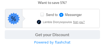
All they need to do is let their store visitors know they can avail an additional 5% discount by subscribing to Messenger updates.
Post which, if a visitor adds a product to their cart and abandons it, the store uses the Messenger to get back in touch with them.
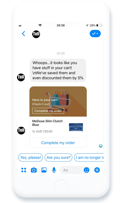
The timely engagement via a channel they are already active on improves the store’s conversions and increases their sales.
Why restrict product page optimization to only on-page tactics, right?
3. Let user-generated content do the convincing
92% of internet users trust recommendations from their friends and family, over advertisements run by brands.
The reason is simple. Brands advertise to promote their unique selling proposition and try to bag more sales.
But when a person shares a rating or a review, it is after trying the product out themselves. They are not angling at increasing the brand’s sales, so nothing they say is a farce.
While most online stores add product reviews and ratings to product pages, not many use the power of user-generated content.
Take for instance all those customers who shared pictures and reviews of your product on their Instagram account. What if you could share those pictures on your product page?
You won’t just get unique content to show how your product looks in different settings, but also show how widely used it is!
Now asking your customers to upload pictures of them using your product is one thing. They may or may not make the effort of doing so.
But what if you could pull in from the public Instagram accounts on auto?
Yotpo lets you do exactly that.
Vanity Planet uses its customer’s Instagram posts to optimize their product pages with visual social proof. The pictures also served as an inspiration to those visitors who were looking for ideas to use the products.
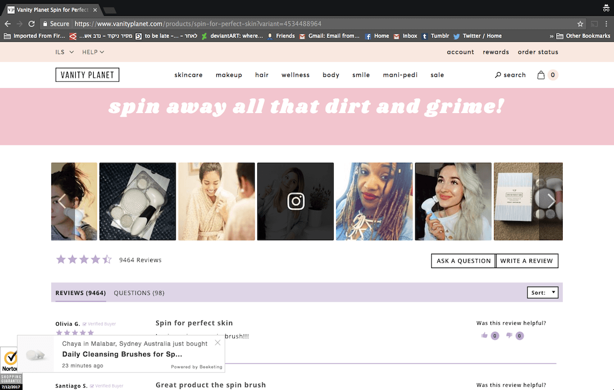
Using user-generated content on their product pages, the store was able to improve its social engagement and also boost their conversion rate.
4. A hint towards an urgency to make a purchase
Visitors don’t immediately turn into customers.
No matter what product they are looking for, they have at least ten stores to purchase from. They are all either offering the same product or similar ones at different prices and sometimes in different varieties.
That’s why it is essential to do what you can to create urgency around making a purchase – on the very first visit.
Now Pandora does this best.
Instead of waiting for the visitor to leave from a product page and then retarget them with messages indicating scarcity, they do it when they are on the page.
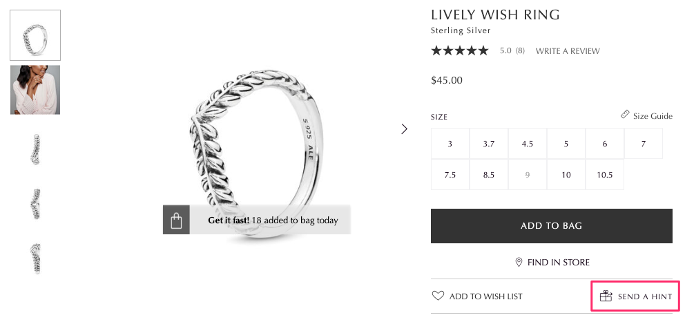
On-site notifications are a great way to keep the visitor’s interested hooked on the product they show interest in.
You can use these notifications to create urgency, a sense of scarcity, when the last purchase of the product was made and how many of the products have been sold so far.
WebEngage lets you create smart on-site push notifications. It takes not of the products a visitor shows interest in. It then enables you to trigger on-site push notifications in real-time to let the visitor know how popular the product is.
So while one is browsing through the site, they can also see the name of the last person who bought a product they showed interest in.
5. Create an in-store shopping experience
What’s the one thing you wish for when you’re shopping online? Especially a new product?
You wish you could touch, feel or even try it on.
You wish there is someone from the store to help you make an informed purchase without being able to do any of the above.
Now live chat is one option.
A shopper feels confused, they drop you a message, and you address their concerns immediately. But what if you didn’t have to wait for them to drop a question?
What if you could create an in-store experience for these shoppers on your online store?
A great example here is that of Nordstrom.
When you visit any of their product pages, you will notice a series of images from all angles to help the visitor understand what the product looks like.
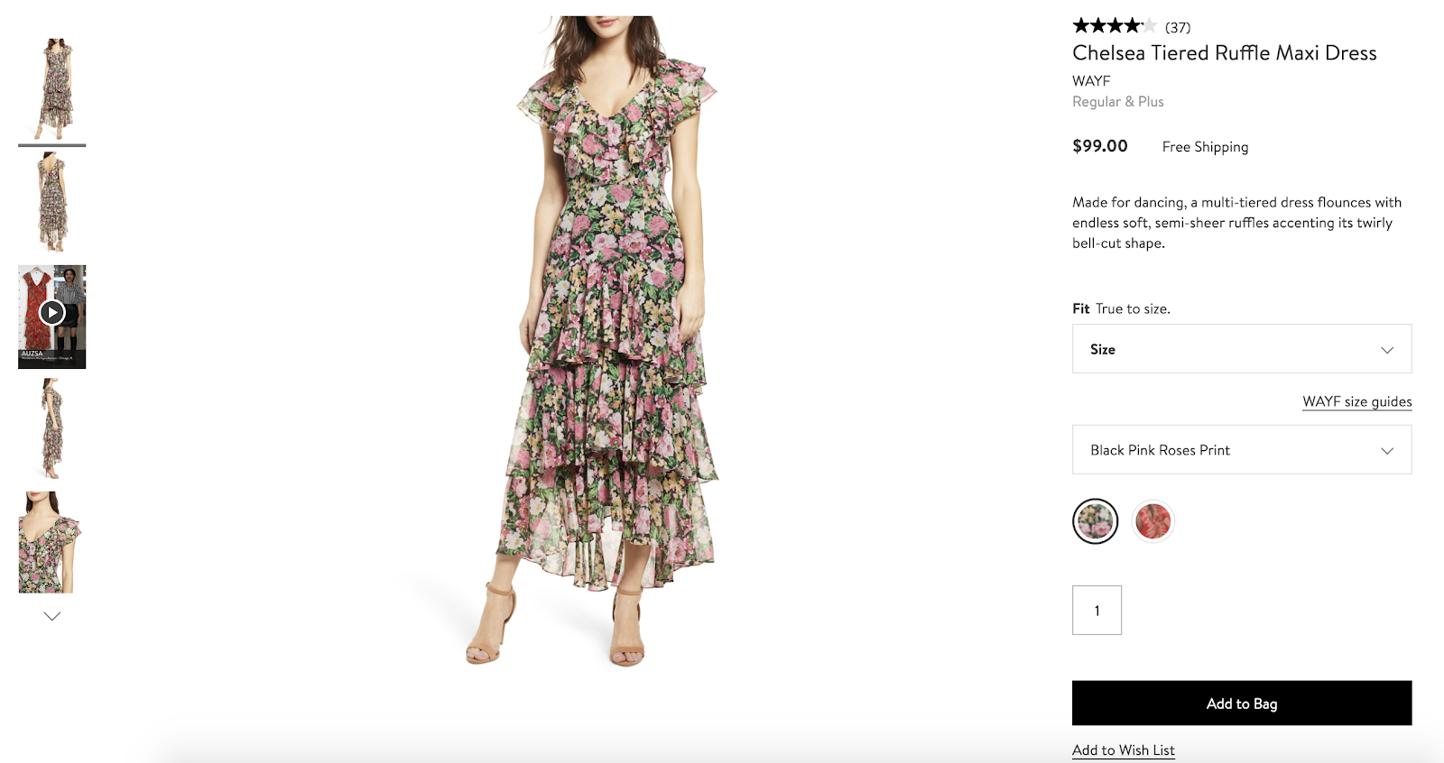
But here’s what they do differently.
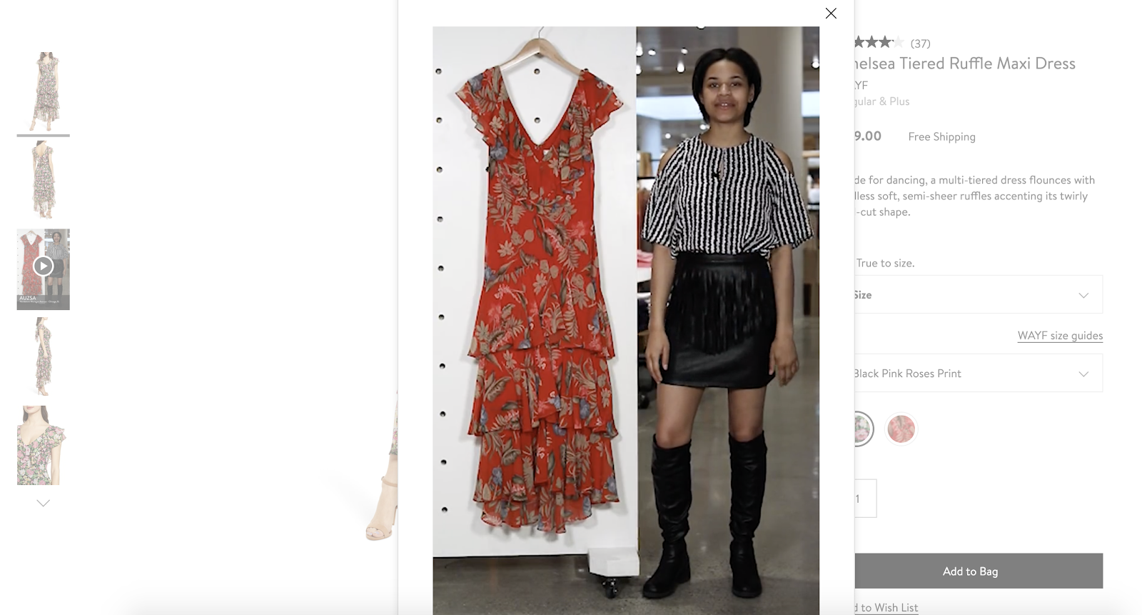
Instead of just adding a video of a model wearing their product, they get their sales reps to explain the product. It’s almost like having a sales rep guide your purchase at a brick and mortar Nordstrom store. Take a look at it, here.
Is your product page optimization strategy on-point?
Yes, optimizing your product descriptions, making your product images and videos better, using social media and other product page optimization tips still hold.
But what we’re suggesting, is making it easy for online shoppers to make informed purchases.
The more comfortable you make for a shopper to know more about your product and why it suits them, the higher are your chances of converting a visitor into a customer.
What other product page optimization tactics have you seen global brands make use of and which ones have you tried using
Ready to turn your product page visitors into customers?


