The checkout page conversion rate is the percentage of shoppers who complete a purchase after initiating the checkout process. Cart abandonment averages 70% across e-commerce, meaning most stores lose the majority of buyers at the final step. The good news: checkout UX improvements can lift conversions by up to 35.26% by targeting specific friction points. Tools like Baymard Institute benchmarks, Shopify Analytics, and Google Analytics funnel reports show you exactly where shoppers exit. This guide covers the highest-impact levers in order of ROI — including the one most teams never see in their funnel: browser extensions and coupon leakage diverting buyers at the moment of purchase. We cover both the friction you designed and the leaks you didn’t.
What checkout design factors most improve conversion rate?
Checkout design is the single biggest controllable variable in your conversion rate. Most abandonment happens not because shoppers changed their minds, but because the checkout process created doubt, confusion, or extra work.
Forced account creation is the most documented conversion killer. Mandatory sign-ups cause roughly 25% of checkout abandonment, according to Baymard Institute’s 2024 benchmark data. Offering guest checkout as the default removes this barrier immediately and costs nothing to implement.
Form field count is the second major lever. The average checkout form contains 11.3 fields, but reducing that to 6 to 8 fields significantly lowers abandonment. Address autocomplete tools like Google Places API cut both time and input errors, which matters especially on mobile.
Pricing transparency is non-negotiable. Unexpected shipping costs cause 47% of abandonment, making late-stage fee reveals one of the most damaging UX decisions you can make. Display shipping estimates on the product page or cart, not at the payment step.
Here is a quick reference for the highest-impact design changes:
| Design factor | Impact on conversion |
|---|---|
| Guest checkout as default | Reduces abandonment by ~25% |
| Form fields reduced to 6–8 | Lowers drop-off and input errors |
| Shipping cost shown early | Eliminates 47% abandonment trigger |
| Trust signals near payment button | Increases payment confidence |
| Progress indicator visible | Reduces cognitive load in multi-step flows |
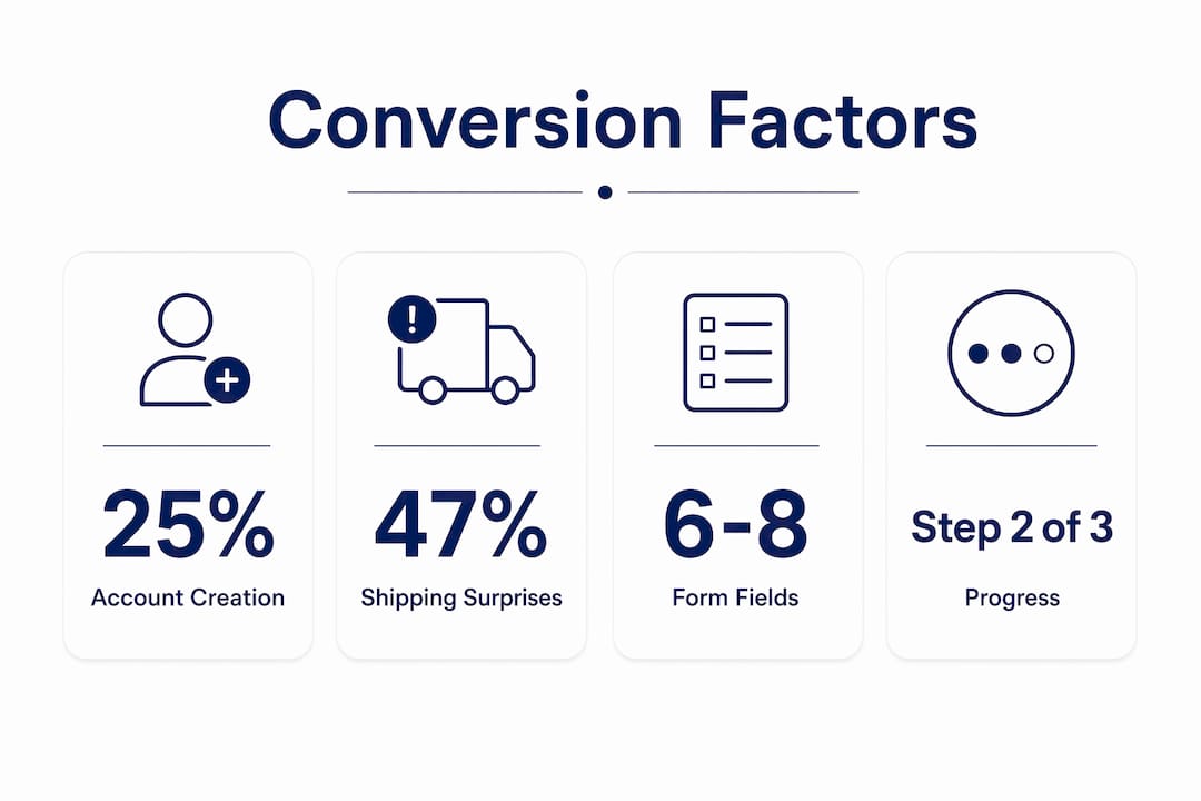
Progress indicators deserve special attention. A simple “Step 2 of 3” label reduces anxiety for first-time buyers by making the process feel finite and predictable. This is one of the cheapest, fastest wins available to any e-commerce team.
How to optimize payment options and speed for higher conversions
Payment friction is where revenue disappears silently. Shoppers who reach the payment step are already committed, but the wrong payment experience pushes them out.
- Add accelerated checkout buttons at the top of checkout. Shop Pay converts at up to 1.72x the rate of standard guest checkout, particularly on mobile. Apple Pay and Google Pay deliver similar speed advantages by pre-filling shipping and billing data.
- Offer multiple payment types. Credit cards, PayPal, digital wallets, and buy now pay later options like Affirm or Klarna each serve different buyer segments. Removing any one of these creates an exit point for the buyers who prefer it.
- Prioritize mobile payment UX. Mobile accounts for the majority of e-commerce traffic, yet mobile checkout completion rates lag desktop. Large tap targets, minimal typing, and wallet-first payment displays close this gap.
- Hit the 3-second load time threshold. Each additional second of load time reduces conversion by approximately 7%. Compress images, defer non-critical scripts, and use a CDN to keep checkout pages fast.
- Watch for scripts you never installed. Coupon and cashback browser extensions inject their own code at checkout — extra pop-ups, auto-applied codes, and “better deal” prompts that add load time and pull buyers off-task. This is invisible in your own QA because it only fires in the shopper’s browser. BrandLock’s ad and extension blocking strips this interference out of the checkout for the 4–5% of traffic affected.
- Analyze your payment funnel step by step. Use Shopify Analytics or Google Analytics 4 funnel reports to identify which payment step loses the most users. Fix the highest drop-off step first before testing anything else.
Single-page vs. multi-step checkout: which works best?
This is one of the most debated questions in checkout optimization, and the honest answer is: it depends on your customer segment and order complexity.
Single-page checkout consolidates all fields into one view. It reduces the number of clicks and can feel faster for returning customers who know exactly what they want. The risk is cognitive overload. Presenting too many fields at once can paralyze first-time buyers or shoppers on small screens.
Multi-step checkout breaks the process into logical stages: contact information, shipping, then payment. Multi-step checkout wins roughly 70% of A/B tests for EU stores, particularly with higher average order values and first-time buyers. The structure creates a sense of progress and makes each decision feel smaller and more manageable.
| Checkout type | Best for | Watch out for |
|---|---|---|
| Single-page | Returning customers, low AOV, simple products | Cognitive overload on mobile |
| Multi-step | First-time buyers, high AOV, complex orders | Too many steps without progress indicators |
Segmenting A/B tests by customer type is the most reliable way to resolve this debate for your specific store. Test new versus returning visitors separately, and test by device type. A returning desktop buyer and a first-time mobile buyer have fundamentally different needs, and a single checkout layout cannot serve both optimally.
Multi-step checkout is not inherently worse than single-page. When each stage has a clear label, a visible progress bar, and no unnecessary fields, it reduces cognitive load rather than adding to it. The mistake most teams make is treating checkout structure as a one-time decision rather than an ongoing test.
What behavioral analytics reveal about checkout drop-off
Funnel reports show you where shoppers leave. Session recordings show you why. Both are required to diagnose and fix checkout conversion problems with precision.
Start by building a checkout funnel visualization in Google Analytics 4 or Hotjar. Map each step from cart to order confirmation and identify the step with the highest exit rate. That step is your first priority, regardless of how obvious or subtle the problem appears.
Checkout funnel analytics combined with session recordings reveal friction points that aggregate data alone cannot surface. FullStory and Microsoft Clarity both capture rage-clicks, form hesitation, and backtracking behavior. A shopper who fills in the payment field, deletes it, and exits is telling you something specific about trust or confusion at that moment.
Detailed checkout funnel heatmaps showing step-level drop-offs and error triggers let you prioritize fixes by revenue impact rather than gut instinct. If 40% of users abandon at the shipping step, that is where your next sprint should focus, not on redesigning the order confirmation page.
Here is the limit of every analytics tool above: it can only show you the friction you built. It cannot show you a browser extension firing a competitor’s offer on your product page, Honey or Capital One Shopping claiming credit for a sale you already earned, or a shopper pasting an expired code, hitting the red error, and leaving. Those losses read as ordinary abandonment — or worse, as a successful sale at a discount you never needed to give. They are the unseen causes of cart abandonment, and surfacing them requires real-time monitoring at the browser level, not another funnel report.
Set a statistical significance threshold of 95% before declaring any A/B test a winner. Checkout changes that look promising at 80% confidence often reverse at scale. Use tools like VWO or Optimizely to manage test validity and avoid premature conclusions. A structured abandoned cart recovery email sequence, with the first email sent within one hour, can recover 5 to 8% of abandoned carts while you work on the root causes.
Key takeaways
Improving checkout page conversion rate requires removing friction at every step, from form length and forced registration to payment speed and pricing transparency — and protecting the high-intent traffic your analytics can’t see.
| Point | Details |
|---|---|
| Guest checkout is non-negotiable | Forced account creation drives away roughly 25% of buyers before payment. |
| Show shipping costs early | Revealing fees at the payment step triggers 47% of all abandonment. |
| Accelerated payments lift mobile conversions | Shop Pay converts at up to 1.72x the rate of standard guest checkout on mobile. |
| Behavioral data beats guesswork | Session recordings and funnel heatmaps identify exact friction points for targeted fixes. |
| Test by segment, not store-wide | Separate A/B tests for new vs. returning buyers and by device type produce more reliable results. |
| The biggest leak is invisible | Extensions and coupon hijacking cost an estimated 3–5% of revenue and never appear in your funnel. |
What we’ve learned from auditing checkout flows across hundreds of stores
The single most underrated fix in checkout optimization is not a design change. It is removing forced account creation. Every audit confirms it. Teams spend months debating single-page versus multi-step layouts while leaving a mandatory sign-up wall in place that is costing them 25% of their buyers. Fix that first. Everything else is secondary.
The second pattern we see consistently is stores that display shipping costs for the first time at the payment step. The shopper has already invested time filling out their information. Seeing an unexpected $12 shipping fee at that moment does not just cause abandonment. It damages trust in the brand. Showing costs early, even if they are not free, converts better because it respects the buyer’s time.
On the analytics side, most teams are looking at aggregate conversion rates and missing the step-level story. A store with a 2.5% overall conversion rate might have a 60% drop-off specifically at the shipping information step. That is a solvable problem, but only if you are looking at the right data.
Then there is the part no UX change can touch. About 4–5% of your traffic doesn’t see the checkout you built — they see one altered by a browser extension. Honey, Rakuten, Capital One Shopping, Avast SafePrice, and Microsoft Shopping Assistant inject competitor ads, claim affiliate credit for sales you already earned, and drop in expired codes that throw a red error and send the buyer away. Invalid coupons alone can pull conversion down by around 25%, and none of it registers as anything other than a normal day in your dashboard.
Run the math the way an operator would: monthly visits × 4–5% affected × your conversion rate × your AOV. For most mid-market and enterprise stores, that figure dwarfs the gain from any single layout test. The fix is a different layer entirely — block the interference, take back the leaked coupons, and meet hesitant or exiting shoppers with a targeted offer instead of a blanket discount.
— BrandLock Analytics
Protect your checkout revenue with BrandLock
Checkout optimization wins back the friction you can see. BrandLock wins back the revenue you can’t. It works on the 4–5% of shoppers whose browsers quietly rewrite your checkout, and on the hesitant buyers a generic pop-up will never convert. Three things, one line of code:
- Block ads & extensions. Strip out the injected competitor ads and “better deal” prompts that lure high-intent buyers off your page.
- Stop coupon leaks. Monitor where your codes spread, and shut down the extensions claiming credit for sales you already earned — so you stop coupon code leakage before it compounds, with 94% fewer offers shown while retaining 80% of promotional revenue.
- Intelligent offers. Re-engage bounce, hesitant, and wishlist shoppers with the right offer at the right moment — driving up to 13× higher revenue per session and the same revenue from 16× fewer sessions.
These unseen causes of cart abandonment cost e-commerce brands an estimated 3–5% of revenue every month and stay invisible to standard analytics. The brands that close the gap aren’t guessing: The North Face recovered a 3% revenue lift with no extra ad spend, alongside MooGoo, JOLYN, and Timberland.
It is a layup to test. Drop one line of JavaScript into Google Tag Manager — live in about five minutes — and A/B test it against your live site so you can watch the lift yourself. Month to month, no lock-in. If you are serious about your checkout page conversion rate, see what your store looks like to the 5% and book a call.
FAQ
What is a good checkout page conversion rate?
A checkout conversion rate above 60% is considered strong for most e-commerce stores, though top performers reach 70 to 80%. Baymard Institute benchmarks place average cart abandonment at approximately 70%, meaning most stores have significant room to improve.
Why does forced account creation hurt conversions?
Forced account creation adds a barrier at the moment buyers are ready to pay. Baymard’s 2024 data shows it causes roughly 25% of checkout abandonment. Offering guest checkout as the default removes this friction without requiring any design overhaul.
How many form fields should a checkout page have?
The average checkout form has 11.3 fields, but 6 to 8 fields is the target for minimizing abandonment. Removing redundant fields and adding address autocomplete reduces both drop-off and input errors, especially on mobile.
Does page load speed affect checkout conversion?
Yes, directly. Each additional second of checkout page load time reduces conversion by approximately 7%. Checkout pages that take longer than 3 seconds to load lose a measurable share of buyers before a single field is completed.
Why is my checkout conversion rate dropping even though my UX is good?
Because not every loss is a UX problem. Browser extensions like Honey, Rakuten, and Capital One Shopping inject competitor offers, claim credit for sales you already earned, and push invalid coupon codes — all at checkout, and all invisible to standard analytics. These leaks cost e-commerce brands an estimated 3–5% of revenue and show up as ordinary abandonment. A browser-level monitoring tool such as BrandLock surfaces and blocks them, which is why it can lift revenue per session well beyond what UX changes alone achieve.
When should I use multi-step checkout instead of single-page?
Multi-step checkout performs better for first-time buyers, higher average order values, and mobile users. It wins roughly 70% of A/B tests in these segments. Single-page checkout works better for returning customers with simple, low-complexity orders.


